When talking about his experience in being a title designer, Kyle Cooper talks about what he believes makes a good title sequence. According to him, a good title sequence:
- Sets an expectation for the movie
The title sequence of a movie really sets the tone. It allows the audience to make preconceptions of what the movie will be like and where the storyline may go.
- Gets the audience excited to watch the film
If a title sequence is completely boring, the audience will not give the rest of the movie a chance. Title sequences need to grab the audiences attention so their minds do not wander.
- Uses the typeface to add to the overall impression of the film
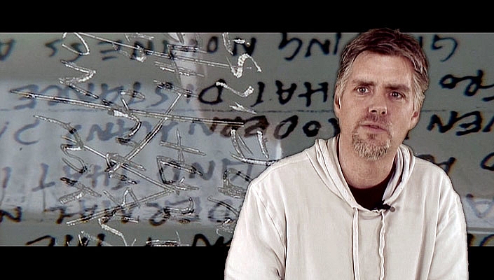
The typeface used in a title sequence has to link to the genre of the film or somehow relate to the story. For example, Kyle Cooper says he used a handwriting typeface in the film "Seven" as it linked to the obsessive nature of one of the characters who would write loads of things down. Also, if you are about to watch a horror film, seeing fancy or curly writing would be unfitting, it needs to relate and add to the tone of the film. For example, The Conjuring:

In this title sequence,the typeface is small and minimal so it does not take away from the image shown on screen behind it.
- Reminds people what the potentialities are in a particular field. Makes them want to get a job being a title designer.
When a title sequence is very interesting or particularly intriguing, people may be inspired to do something similar.
No comments:
Post a Comment